Taylor Swift’s albums are more than just music—they’re stories told not only through lyrics but also through the stunning album covers that introduce us to her world. With each album, Taylor captures a moment in her life and career, often reflecting her evolution as an artist. From the country roots of her early days to the pop masterpieces of recent years, each album cover is a piece of art in itself.
Explore the hidden stories and artistic brilliance behind Taylor Swift album covers. Learn how her visuals have evolved with each era, blending symbolism, style, and Swift’s personal journey.
Taylor Swift: A Global Superstar
Taylor Alison Swift is a multi-platinum, award-winning American singer-songwriter and pop culture icon. Born on December 13, 1989, in Reading, Pennsylvania, Swift rose to fame with her unique blend of country, pop, and rock music.
Artistic Evolution and Accolades
-
12 Grammy Awards
-
24 American Music Awards
-
24 Academy of Country Music Awards
-
12 Country Music Association Awards
The Meaning Behind Taylor Swift Album Covers
Let’s face it—Taylor Swift never does anything without intention. Each album cover has a purpose, whether it’s subtle or screaming from the rooftops. So, what’s the secret sauce behind these images?
- Visual representation of the music: The vibe of each album cover is always a perfect match for the album’s sound. Fearless? Free-spirited and youthful. Reputation? Dark and unapologetic.
- Themes and symbolism: From hats and lipstick to fields and forests, the props and settings on Taylor’s covers always have deeper meanings.
- Artistic evolution: You can trace her growth as an artist, from the innocent country girl on her debut album to the indie-folk storyteller on Folklore and Evermore.
Overview of Taylor Swift Album Covers
Taylor Swift album covers have become iconic, reflecting her journey from a country music newcomer to a global pop sensation. Each cover serves as a visual narrative that aligns with the themes and emotions of the corresponding album.
1. Taylor Swift (2006)

Taylor’s self-titled debut album introduced the world to a fresh-faced teenager with country roots. The cover features Taylor Swift in a serene natural setting, with curly blonde hair cascading down her shoulders. Wearing a light-colored, flowy dress, her gaze is soft, capturing a youthful innocence that resonated with her early audience. The country-inspired aesthetic perfectly matched her sound at the time, showcasing her wholesome image and her passion for storytelling through music.
- Color Palette: Earth tones, gold, and soft hues.
- Key Visual Elements: Simplicity, natural light, and focus on Taylor’s soft, approachable persona.
2. Fearless (2008)

The Fearless album cover takes a more dynamic turn, with Taylor captured in a moment of movement. Her curly locks are blown outward, as if caught in a gust of wind, symbolizing the boldness and emotional freedom that defined the record. In this shot, her eyes are closed, suggesting a sense of introspection and the desire to fearlessly explore deeper emotions.
- Color Palette: Gold, white, and ethereal tones.
- Key Visual Elements: Movement, hair blowing in the wind, and a sense of dramatic flair.
3. Speak Now (2010)
For Speak Now, Taylor transitions from the country-pop artist we knew into a more mature version of herself. The album cover reflects this transition with an elaborate, purple gown that swirls around her. The cover seems almost cinematic, with Taylor standing out against a plain background, her hair styled with just enough glam to hint at the new pop influences creeping into her music.
- Color Palette: Royal purple, gold, and soft contrasts.
- Key Visual Elements: A grand dress, theatrical elements, and movement representing personal growth.
4. Red (2012)

With Red, the tone of Taylor’s artistry starts shifting noticeably. The cover reflects this change, with Taylor shown in close-up, sporting a sophisticated look that marked a new chapter in her career. Gone is the curly hair, replaced by a straighter, more mature style, and the color red dominates the cover, signaling the album’s theme of intense emotion and heartbreak. The cover exudes sophistication and distance, showcasing Taylor’s evolving persona.
- Color Palette: Red, beige, and muted tones.
- Key Visual Elements: Strong use of red, close-up of Taylor, and a more mature expression.
5. 1989 (2014)
For 1989, Taylor fully embraces the pop star within her, and the album cover makes that declaration clear. The Polaroid-style photo of her face is partially obscured, a choice that allows fans to project their own emotions onto the music while still maintaining a connection with the artist. The 1989 album cover feels retro yet fresh, echoing the nostalgia and creative energy of the album itself, which draws heavy inspiration from 80s synth-pop.
- Color Palette: Pastels, sky blue, and soft neutrals.
- Key Visual Elements: Polaroid aesthetic, partial obscurity, and a pop-art influence.
6. Reputation (2017)

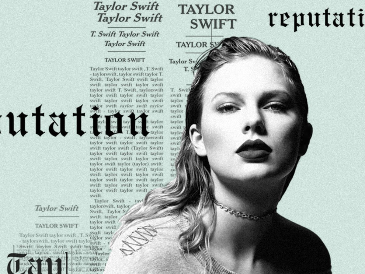
When Reputation dropped, Taylor’s persona took a complete 180. The album cover boldly depicts this shift, showing Taylor in grayscale with her face partially obscured by tabloid-style newspaper clippings featuring her name. The bold fonts and stark contrasts convey the darker, more defiant tone of the album, representing Taylor reclaiming her narrative in the public eye.
- Color Palette: Black, white, and grayscale.
- Key Visual Elements: Newspaper print, bold fonts, and a rebellious undertone.
7. Lover (2019)

Taylor returns to a lighter, dreamier aesthetic with Lover, where pastel colors dominate the cover. She appears against a cotton candy-colored sky, her face adorned with glitter and a whimsical expression. This cover reflects the theme of love in all its forms, portraying a sense of freedom, joy, and innocence that contrasts starkly with the dark themes of Reputation.
- Color Palette: Pastel pinks, blues, and light yellows.
- Key Visual Elements: Glitter, soft colors, and a dreamy atmosphere.
8. Folklore (2020)

Folklore marked a massive departure from Taylor’s previous aesthetics. The black-and-white image of Taylor standing alone in a foggy forest represents the introspective and quieter tone of the album. The cover perfectly complements the acoustic, indie-folk style of the music, offering a reflective mood that contrasts with the pop-heavy sounds of her previous works. It signals a retreat into a world of storytelling and personal introspection.
- Color Palette: Black and white, grayscale.
- Key Visual Elements: Minimalism, nature, and a sense of solitude.
9. Evermore (2020)
Released just months after Folklore, Evermore continues the earthy, introspective vibes but with a warmer twist. On the cover, Taylor is photographed from the back, wearing a long plaid coat with her hair in a braid, looking out over a wintry landscape. The cover suggests a continuation of the themes from Folklore but with a new perspective—one of endurance and acceptance.
- Color Palette: Earth tones, warm browns, and soft wintery hues.
- Key Visual Elements: Plaid, nature, and a sense of continuation from Folklore.
10. Midnights (2022)

The cover for Midnights portrays a contemplative Taylor in soft lighting, holding a lighter flame. The intimate, nocturnal vibe of the cover reflects the late-night, personal confessions that fill the album. Her makeup is bold, but the image is soft, hinting at a blend of vulnerability and strength. It’s a new side of Taylor, one that feels both personal and universal.
- Color Palette: Soft blues, dark purples, and moody hues.
- Key Visual Elements: Intimacy, light in darkness, and a sense of vulnerability.
Why Taylor Swift Album Covers Are Iconic
So, what makes Taylor’s album covers iconic? It’s not just the aesthetic appeal—though, let’s be real, they’re always stunning. It’s the deeper meanings, the evolution, and the way they perfectly capture the essence of each era.
- They reflect her personal and artistic journey.
- They always match the mood of the music.
- They’re full of Easter eggs and hidden messages for fans to dissect.
Taylor Swift is a master at blending music and visuals to create an immersive experience for her listeners. Her album covers are no exception!
FAQs
Q: Why does Taylor Swift hide part of her face in some of her album covers?
A: It’s often a way to draw attention to the music rather than her image. In albums like 1989 and Reputation, it also reflects themes of mystery, fame, and public perception.
Q: Which Taylor Swift album cover is the most iconic?
A: This depends on who you ask! Many fans love the boldness of Red, while others appreciate the artistic vibe of Folklore and Evermore.
Q: Why did Taylor Swift use a Polaroid-style photo for 1989?
A: The Polaroid is a nod to the nostalgic ’80s pop era that Taylor pays homage to in the album, both musically and visually.
Q: How does Taylor Swift choose her album cover themes?
A: Taylor is very hands-on with her art direction. Each album cover is chosen to visually represent the themes, moods, and emotions explored in the music.
Conclusion
Taylor Swift album covers are not just images—they are visual stories that evolve along with her sound. From the sweet, country girl next door to a pop icon reclaiming her voice, each cover reflects her growth both as a musician and a person. These covers have become iconic in their own right, cementing their place in pop culture and reflecting the depth and range of Taylor’s artistry.


